In most schools of thought you should never put colour on a CV. We have seen many CVs though that have used colour with striking effect. Blues can look particularly pleasing and not too offensive to even the most conservative tastes.
There is an obvious exception though: the creative industries. I recently saw the most fabulous CV from a web designer. It had colour pie-charts that were tongue-in-cheek and not data heavy at all. It fizzed with personality and was designed to be submitted to a small-scale enterprise made up of designers and web-geeks. The job ad was infused with personality and the CV had been designed as a razor sharp response in the dialogue: he got the job.
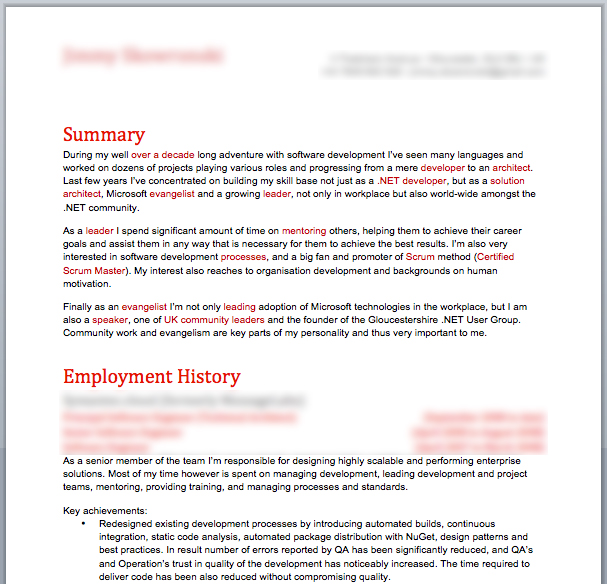
Here is an example of a CV that was submitted to us. It used red and cool greys have been used to offset the impact.
Could this sort of daring backfire or is it worth the risk to make an impact in a crowded labour-market?

No comments yet.